Ready to make sure your business signage jump out from a crowd of competitors? Whether you have a shop on the high street, a restaurant on a retail park or a garage on an industrial estate, visual competition is high and you need to work your marketing budget hard for results. These steps will set you on the path to signage success.
1. Really plan ahead
It’s all too easy to decide that you need a piece of signage and then fail to consider the detail. What is the purpose of the sign? Where will it go? What materials should you use? How will it be installed? Do you just need one sign or a suite of signs to provide a coherent customer experience? Will it be a regulated sign that determines its design or can you use a graphic designer to present your brand and message in the right way?
Sit down and determine the details before you plough ahead or your marketing budget and results may turn out to be less impressive than you’d hoped.
2. Use a professional
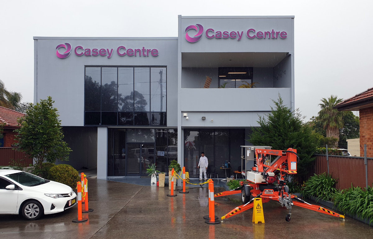
When you invest in a piece of physical business signage, you are investing in something that should stand the test of time. So use a graphic designer to produce the artwork, a communications professional for wording if you are likely to use more than basic copy and a professional sign manufacturer who can advise on materials and placement and handle installation too where required.
3. Be mindful of typography
Your business sign must be legible and accessibility is a key concern. Use a font which doesn’t have serifs for important information and consider contrast carefully, so that the text jumps out and is easy to read. It needs to be large enough too. Professional sign designers will apply visibility rules to your sign which depend on their placement, height, the distance from which the audience will read them and the speed at which your audience will be travelling (for example, by car or by foot.)
Maximize negative space around keywords and messages. Consider back lighting too, especially if the sign will be placed in a dim space or outdoors where visibility needs to be enhanced during darker hours.
4. Stay on brand
Use your brand guidelines to help create a sign that fits with your overall logo and colour palette. Use your brand’s approved typography and ‘look and feel’ and be sure to pass any brand guidelines to your designer. If you are a small business and don’t have formal brand guidelines, share examples of your existing marketing and examples of signage that you think is good and relevant for your business.
5. Look at the overall space
If your sign is to be used indoors, then look at the overall finish. Interior designers tend to adopt a rule of 60% neutral shades, 30% dark – often furniture or a feature wall – 5% warmly coloured accents and 5% bright colour-pop accents. You can use your signage as a bright accent shade which doesn’t tip your overall design off balance, but which breaks up the space and creates a visual focus.
6. Consider bold geometric
Signage goes through trends in the same way that any type of interior design does. One particular growth trend involves geometrics, with their bold shapes, sharp edges and arresting finish. Custom metal geometric signs are a popular way to create these and some brands are placing their name and logo against coloured geometric backdrops. You can also do a video wall wherein you can choose how LED or LCD screens layout.
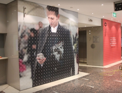
This type of bold signage is great for interior signage, especially where it’s being applied to a plain wall without any other type of visual interest. Geometric signs look great in a business reception space, for example.
7. Do a walkthrough
In thinking about signage location, do a walkthrough in the way that your target audience will. Approach from different angles, pass on foot, by bike or by car, try to see it from the lift or stairs, for example. Check height, readability and general access, such as other things hanging in the way which might prevent the sign from being seen.
Your sign manufacturer will usually carry out a site visit for you and deduct the cost from the subsequent order. This is important too from an installation and health and safety requirements perspective.
8. Remember digital signage
Many businesses are investing in digital signage for certain parts of their operation; for example, to advertise campaigns or daily offers or to provide changing messages in areas such as a waiting area, reception or canteen. Digital signage can be a larger upfront investment but the ongoing cost is low and limited to the production of digital graphics.
These types of sign are also visually appealing and naturally backlit for visibility, allowing for great creativity and brand awareness, as well as total flexibility on regular message changes and updates.
The Bottom Line
Consider these aspects when you next need to produce business signage and the final result should far better fit your needs.



Leave A Comment